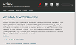
[caption id=”attachment_646” align=”alignright” width=”255” caption=”New Site Design”] [/caption]
Last time I did a custom re-design for my site was way back during my blogspot time. That was in 2006 – five years have passed but I still like the design. When I moved to wordpress.com, I didn’t have a way of creating my own design so I stuck with the best design I could find. I moved to my own host here at CSRDU last year but didn’t really feel the need to create a custom design. The result, even with the great theming mechanism provided by Wordpress, I never wrote a custom theme for my site. I always stuck with existing freely-available themes that always left me wanting more in one department or another. Either the typography wasn’t up to par or I didn’t like the comments layout. So, I always had to settle with whatever I could find.
That changed a couple of days ago when I came across a typography post on some blog which inspired me to begin my own wordpress theme. I had one clear goal in mind – improve readability. People come to my site mostly to read the tutorials. It’s not fair if I give text secondary importance focusing on the layout. So, I started customizing the sandbox wordpress theme. It has the cleanest markup and I was able to make all the changes simply through a custom CSS. I went with a fairly large serif font (Georgia) for the content with a sans-serif (Open Sans) font coming from Google Webfonts for the post titles. I also have a slight text shadow effect but it wont’ be visible if you’re using IE. There’s only around 5 images in the whole theme plus two fonts. So, the overall result is a fairly lean page with clear fonts and layout.
As always, all comments and criticism is most welcome.